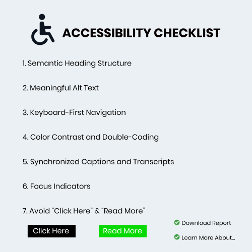
Accessibility isn’t a “nice-to-have” feature it’s a fundamental pillar of user experience. For those of us working within the Adobe ecosystem whether you’re building responsive modules in Adobe Captivate or designing resources in Illustrator here are the seven non-negotiables for your accessibility checklist.
1. Semantic Heading Structure
Think of headings as the skeleton of your course. Screen reader users often “skim” a page by jumping from heading to heading to understand the hierarchy of information. If you simply make text bold and large to indicate a new section, a screen reader won’t recognize it as a milestone.
In Adobe Captivate, ensure you are using the designated Heading tags (H1, H2, H3). This creates a logical flow that allows learners to understand the relationship between topics without needing to see the layout. This aligns with the international Web Content Accessibility Guidelines (WCAG) which serve as the gold standard for digital inclusion.
2. Meaningful Alt Text (Beyond the Basics)
We all know we need alternative text for images, but “Image of a man sitting at a desk” rarely helps a learner. The goal is to convey the purpose of the image. Is it a decorative flourish? If so, hide it from the screen reader. Is it a chart showing quarterly growth? Then the alt text needs to summarize that data.
Writing effective descriptions is an art form. If you’re struggling with how to describe complex visuals, you might find some great strategies on how to write descriptive alt text that truly serves the user.
3. Keyboard-First Navigation
If you’ve ever tried to navigate an eLearning course using only your ‘Tab’ and ‘Enter’ keys, you know how quickly things can go wrong. Many learners with motor impairments cannot use a mouse.
Your checklist must include a “No-Mouse Test.” Ensure that every interactive element like buttons, form fields, and drag-and-drops is reachable and functional via keyboard. In Adobe tools, pay close attention to the “Tab Order” panel to ensure the navigation flows logically from top-to-bottom and left-to-right.
4. Color Contrast and Double-Coding
Color is a powerful tool for emphasis, but it shouldn’t be your only tool. If you use a green border to indicate a “correct” answer and a red one for “incorrect,” some learners literally won’t see the difference.
Always “double-code” your information. Use an icon (like a checkmark or an X) alongside the color. Additionally, use a contrast checker to ensure your text-to-background ratio is at least 4.5:1.
5. Synchronized Captions and Transcripts
Video content is a staple of modern eLearning, but it can be a massive barrier for those with hearing impairments or those in noisy environments. Adobe Premiere Pro and Captivate make it relatively easy to add closed captions, but the key word is accuracy.
Auto-generated captions are a starting point, not a final product. Take the time to edit them for punctuation and speaker identification. Providing a downloadable transcript is also a huge win, as it allows learners to search for keywords or review content at their own pace.
6. Focus Indicators
Have you ever noticed a blue or orange box that appears around a button when you tab through a website? That’s a focus indicator. It’s the visual “You Are Here” marker for keyboard users.
Designers often find these “ugly” and try to hide them using custom CSS or project settings. Please, don’t. Without a clear focus indicator, a keyboard user is essentially navigating in the dark. Instead of hiding it, style it to match your brand while keeping it highly visible.
7. Avoid “Click Here” and “Read More”
Descriptive link text is essential for both accessibility and SEO. When a screen reader pulls up a list of all links on a page, seeing “Click Here” five times gives the user zero context.
Instead of: “To see the full report, [click here].” Try: “[Download the 2024 Accessibility Compliance Report] for more details.”
This small shift makes the experience much more intuitive for everyone.
Final Thoughts
Designing for accessibility doesn’t stifle creativity, it forces us to be more intentional. When we build courses that work for people with disabilities, we end up building courses that work better for everyone.

